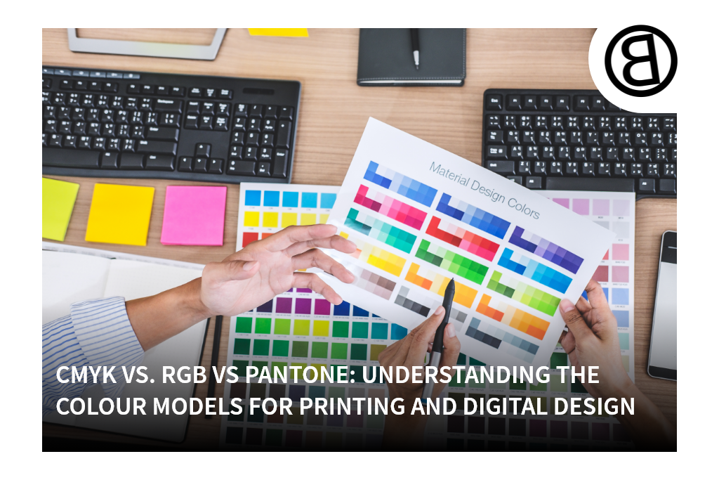

CMYK vs. RGB vs Pantone: Understanding the Colour Moudels For Printing And Digital Design
Whether you are a graphic designer, marketing professional or small business owner, it’s vital to know and understand the differences between the three colour models in common use today. Join us as we explore each model and discuss the differences by comparing CMYK vs. RGB vs. Pantone. Understanding the colour models for printing and digital design in more depth will give you greater control of your palette and greater accuracy in colour reproduction.
What Is RGB?
RGB is a colour model primarily used to facilitate the interpretation, reproduction and display of images on computer monitors and smartphone/tablet screens. It is an additive colour model, which means new colours are formed by adding the three primary colours together in different combinations. As more colours are added, the tone becomes lighter, i.e. tinted.
What Is CMYK?
CMYK is a colour model used in colour printing processes. It is a subtractive colour model, which means colours are subtracted to make new, darker colours. Printing ink makes white paper less reflective, so the more ink used, the darker the resulting colour.
What Is Pantone?
Unlike RGB or CMYK, Pantone uses a standardised colour reproduction system that utilises an 18-colour palette to create colours that are accurately described with a unique (machine-readable) code.
The Key Differences Between CMYK, RGB & Pantone
We can summarise key differences between CMYK, RGB & Pantone as follows:
- CMYK is a subtractive colour model used in the printing industry.
- RGB is an additive colour model widely used in the electronics industry to interpret and represent colours on TVs, monitors and other screens designed to show still or moving images.
- Pantone is a colour-matching system that uses a solid spot-colour palette rather than individual dots or pixels (these solid colours are created with the CMYK colour model).
Which colour model or system you should use will depend mainly on what you are doing and, to a lesser degree, your priorities.

When to Use Each Colour Model
If you are not sure which colour model or system to use, these guidelines may come in handy:
- When creating images for websites and apps, i.e. images that must be reproduced on digital screens, use the RGB colour model.
- For projects focused on the creation of printed materials such as magazines, posters and books, use the CMYK model.
- When designing logos and headed stationery, it is best to use Pantone colours to ensure uniform results.
Help From the Colour Specialists
At Bladon WA, we understand the importance of colour accuracy and consistency in representing your brand. Whether designing for digital or print, knowing the difference between CMYK, RGB, and Pantone ensures your promotional products stand out with vibrant, precise colours. If you’re ready to create products that leave a lasting impact with perfect colour representation, contact us today. Let us help you bring your brand to life with expertly crafted designs tailored to your needs.